Quantcast
Channel: Civil War Quilts
Viewing all 1023 articles
Browse latest View live

"Confederate Quilts"

$
0
0
Linsey nine-patch quilt
Did people refer to home-woven linsey quilts
as Confederate Quilts?

Regina Brant 1840
This is one of the few home-woven, wool/cotton fabric quilts I've seen with a date on it. The machine stitching and the print on the back indicate it was finished after 1840, however, probably after the Civil War. The signature style also seems inconsistent with a date of 1840. Shouldn't Regina have embroidered that signature in cross-stitch? The stitch style and the color of the thread also look late-19th century. Too bad the home woven plaids and solids offer us no assistance in dating the quilt.

A digital search for the two words Confederate Quilt does come up with one reference to a quilt of  home-woven fabric..


Newspapers printed an account of "Women's Wear in Wartime," which may have originated in the Charlotte Observer in 1905. The article was copied in many other papers, North and South, in 1905 and 1906.


The unknown author recalled:
"We had one cotton mill to spin a warp. The people stood in line to get a bunch of cotton for warp. The filling was yarn, cotton, flax and tow. We got our dyestuff from the forest...There was a great rivalry among the women to see who could have the prettiest dress. I have a quilt made of cotton and linen called a Confederate quilt."
The fabric she remembers was home woven cotton and linen. One sees more quilts made of combined wool and cotton.

In her article "South Carolina Quilts and the Civil War" in Uncoverings 1985, Laurel Horton writes that home manufactured cloth was "generically called confederate homespun. 'Confederate' was a term applied to many homemade, generally inferior items, such as 'confederate' coffee made from peanuts..." But, she notes:
"None of the makeshift 'confederate' quilts are known to survive."

Linsey nine-patch quilt, date?

In the thirty years since she did that research we still know little about homespun quilts made during the years of the Confederacy.

One problem is in dating the linsey and other homespun fabrics. They looked much the same throughout the 19th century so determining whether homespun fabric was made in 1790, 1860 or 1890 is difficult.

Home-woven fabric on the reverse side of a wool calimanco
quilt from the 18th century.
Missisquoi Historical Society Collections in Quebec.

The blue is probably wool, the lighter color linen:
traditional linsey woolsey.

Similar fabric in a Tennessee quilt, last half of the 19th century,
blue wool, white cotton.

Above and below, linsey quilts documented in the Quilts of Tennessee
Project, pictures from the Quilt Index, probably post-Civil War.


Other hits in online searches for "Confederate quilt" seem to mean a generic name for a Southern quilt. In the article below a Confederate Quilt was raffled. The only description: it "was a very handsome one."


Ocala (Florida) Banner,
June 30, 1905


Read Laurel Horton's article "South Carolina Quilts and the Civil War" in Uncoverings 1985 at this link at the Quilt Index:

Starsin a Time Warp 7: Madder-Style Prints

$
0
0
Reproduction star in madder-style prints by Becky Brown

Vintage quilt about 1870
Many madder stars set in chrome-yellow sashing. Quilt 
from the Holstein collection of the International Quilt Study Center & Museum.


Madder-dyed prints filled the scrapbag of the 19th-century quiltmaker. 

"Union Prints Warranted Madder Colors"
guarantees the label from the collection of the American Textile History Museum.

See a page of their bolt labels advertising madder colors at this link:

Vintage star quilt from about 1840-1890
The dyers called the process Madder-Style

Madder style prints were popular due to many factors. 
  • It was an inexpensive (if complicated) dye process that produced a range of color. 
  • The dyes were colorfast.
  • The colors were considered quite appropriate for women's clothing (as Turkey red or Chrome orange were not.) .
  • Madder calicoes were a mid-19th-century fashion fad for clothing  perhaps because these were the colors in the equally fashionable Kasmir (paisley) shawls of India.
A vintage madder-style cotton imitating a hand-woven
wool shawl print, about 1870. We call it
a paisley.

The paisley print above shows the variety of colors obtained from one dye by manipulating the various mordants or metal salts that fix the dye to the fabric. This process of mordant-printing allowed several characteristic shades, most tending towards red. (I'm not sure how that gray blue was printed.)

1. Chocolate Brown. Customers and dyers have long called the darkest brown Chocolate.

Here's S.F.'s first reproduction star, a lovely combination
of madder reproductions with chocolate.

Chocolates and shirtings, reproduction blocks by
Bettina Havig.


Reproduction star by Bettina  in a plum paisley from my Ladies' Album.


2. Plum. Madder also produced a dark purple-red brown called Plum in the early-19th-century and Puce later on.

Vintage star from about 1840-1890

3. Miscellaneous browns from medium to light---all on the warm side or red side of the color wheel.


The more greenish or yellow-browns in this vintage block were probably produced
by different dyes. The star points are definitely madder-style.


3 vintage blocks taken from an old top probably about
1870

4. Orange. Shades from cinnamon to pumpkin to terra-cotta.
(Double pink is actually a madder-dye, but a different process
so the printers didn't classify it as madder-style)


Reproduction from Lisa at Ivan& Lucy blog

Reproduction Print: 
Nineteenth Century by Froncie Quinn, Hoopla

Vintage block, maybe 1830-1850

A variation on the orange is a pinkish-orange, not very bright, tending towards peachy.

Vintage block, perhaps 1840-1860.
Madders are hard to date because they were printed over
such a long period of time.


Victoria Carroll's repro block.

These peachy oranges are harder to find than the browns and the reds.

Reproduction Print: Paula Barnes

Oranges were featured in my Moda line
Civil War Crossings from several years ago.

Reproduction block, North Star by Sanguine Stitcher

5. Madder red. A brick red, warm, reddish-brown, robin's breast red... You do find it in solids as in the North Star above.

A recipe for a madder-style printed plaid from the circa 1830 George Haworth recipe book in the collection of the Connecticut Historical Society. See a post about the manuscript here:

Reproduction star block by Jeanne Zyck from madder reds in my
Civil War Jubilee collection

Reproduction Print: Savannah from Makower

Reproduction quilt: Cinnamon Stars by Jo Morton
Fabric and quilt by Jo, who often features 
madder reds in her excellent reproduction collections.

It's difficult for beginning stash collectors to distinguish between madder red and Turkey red.

I found a good example of vintage madder red on the left at Cyndi's Busy Thimble blog. On the right some vintage Turkey reds from my collection. It takes time to learn the differences. Madder reds tend to be duller; they tend to have different colors in the figures. To confound the issue, both red print styles are obtained from madder dye. Turkey red is more complicated and was more expensive.

Here's Amy's first repro block: It's red with yellow figures---
just like Turkey red, but I would classify this more as madder red.

Judie Rothermel reproduction print.
A little warm gold is good as an accent---which
of course confuses the issue with Turkey red.

Vintage print with madder red, orange, chocolate, white background showing through plus a yellow gold. It's madder style rather than Turkey red style.

And so is this vintage red block. Again, there is blue
in the points but you can't call it Turkey red style.

Vintage Turkey red solid---it's brighter, redder.
I realize the issue is like trying to decide if tomatoes are a vegetable or a fruit. 

Well what's the worst that can happen? You bought it for Turkey red and it's more madder-style. They are both mid-19th century fads and make a repro quilt look authentic. Quilters mixed them. Red was red.


Quilting Twin Keryn is working on this reproduction star in 2015.

What to Do With Your Stack of Star Blocks?
Alternate Simple Applique Blocks.

Froncie Quinn did a copy of the Sarah Johnson quilt at the Shelburne Museum
for her Hoopla Patterns Shelburne Repoductions. Here's the center as a miniquilt.

And a version of the center detail by Rosemary Youngs.

Sarah Johnson surrounded her center with a field of stars and alternate plain blocks. The  quilt is dated 1826. See the pattern here:

Here's a detail of a mid-19th century quilt that Fourth Corner Antiques
posted on their online shop inspiring me to trace around some 5" leaves.

One More Thing About Madder

Vintage quilt about 1870-1890
The vegetable dye madder must be combined with mordants of metal salts to create fast colors. The browns were mordanted with iron. Iron rusts. Madder prints rust too. The dark brown stripes above are oxidizing---reacting to the oxygen in the air and disintegrating.  


It looks like all the madder browns in this mid-century quilt are 
tendering (rotting).

The more iron mordant the darker the brown. The more iron mordant the more fragile
the old print. Dark brown figures and backgrounds are often the first to fall apart in an antique. We don't use madder dyes anymore so browns are much more stable.


A collection of  vintage books covered in madder-style cotton prints, Skinner Auctions

More evidence of how common and inexpensive madder prints were. I'm inspired to to cover all my books.

Rachel Littler Bodley and a Patchwork Mystery

$
0
0
Rachel Littler Bodley (1831-1888)

This carte-de-visite (CDV) photograph of a young woman has been described as a woman wearing a Balmoral skirt.


Peterson’s Magazine 1861
 Balmoral skirt:
a striped or plaid underskirt
revealed by a turned-up (retroussé) overskirt.


If you look closely she is holding or
wearing a patchwork item over that striped underskirt.

Who is she and what is that bound piece of patchwork?

From her hairdo and the her clothing we
can guess the photo is from about 1860.
The woman is identified as Rachel Littler Bodley of
Cincinnati, Ohio, who would have been about
30 years old in 1860.


The objects in the photo tell us something about her. Note the microscope and glass vial on the desk. Rachel was a chemist, the first woman professor of chemistry at a medical school when she became Chair of Chemistry and Toxicology at the Women's Medical College of Pennsylvania in 1865. She may have posed for this portrait then, or perhaps it was a celebration of an earlier triumph in 1862 when she became a professor of natural sciences at the Cincinnati Female Seminary.

The objects on the floor and plant stand include books,
perhaps her science and medicine books plus 
a copy of a privately printed book she finished in 1865.

Rachel Bodley's Catalogue of Plants
Contained in the Herbarium of Joseph Clark.


The basket at her feet and the one on the plant stand may be full of plant specimens symbolizing her interest in botany.

But the piece of triangle patchwork? 
It certainly looks like an overskirt.

Bodley's papers are at Drexel University, but I can't find the source for the CDV. 

I think I'll go as Rachel Bodley if I ever go to a Civil War re-enactment.

Read her book here at Google Books:

The Poem on the Anti-Slavery Cradle Quilt

$
0
0
The cradle quilt attributed to Lydia Maria Child is on the cover of
Mary Babson Fuhrer's recent book A Crisis of Community,
a good image for a study of a New England town.
Read a post about this antislavery quilt from the collection
of Historic New England here:

And an article about the quilt by Historic New England's Curator Nancy Carlisle here:

Lydia Maria Francis Child
1802–1880

Child is remembered as an anti-slavery activist, but she first achieved fame in the 1820s at the age of 22 with a novel Hobomok, A Tale of Early Times, remarkable in being an early historical novel, one written by a woman and one told from a woman's point of view.

Hobomok was published anonymously in 1824,
 "By an American."

She supported herself and her husband author David Lee Child with her literary successes, including childrens' books with moral themes, womens' advice books, political columns for newspapers and editing a childrens' periodical.

The Juvenile Miscellany, 1832, edited
by Mrs. D.L. Child

As antislavery activists in Massachusetts became more radical, Child did too. Her 1833 essay An Appeal in Favor of That Class of Americans Called Africans was one of the books that influenced the growing antislavery movement. But it also ruined Child's literary career. Her books were boycotted and she lost her editorial job. She continued to edit radical books, among them the 1834 gift book The Oasis, a miscellany of stories and poems with an antislavery theme.


The Oasis contained a poem called Remember the Slave. It's first two verses are inked onto the cradle quilt made two years later, which is now in the collection of Historic New England.

REMEMBER THE SLAVE.
Mother! when around your child
You clasp your arms in love,
And when with grateful joy you raise
Your eyes to God above, —
Think of the negro mother, when
Her child is torn away,
Sold for a little slave, — oh then
For the poor mother pray!


The table of contents (a portion here from an edition on Google Books) indicates that
Mrs. Follen wrote "Remember the Slave". Lydia Maria Child ("Editor") wrote "Malem-Boo" and the editor's husband David Lee Child wrote "Henry Diaz." 

But over time the poem was reprinted with credit to the editor rather than to Mrs. Follen,


as in this 1837 reprint in Thomas Price's compilation
  Notices of the Present State of Slavery where the poem
is published as "By Mrs. Child."

Who was Mrs. Follen? 

Eliza Lee Cabot Follen
(1787-1860)

She was a good deal like Mrs. Child, a little bit older and much wealthier (one of the Boston Cabots,) She married poet Charles Follen, a German immigrant forced to leave Hesse-Darmstadt for his radical ideas. He continued to act upon them in the United States where he and Eliza were outspoken in their antislavery beliefs.

Like Lydia Child, Eliza Follen published essays, compilations
and books for children...


and anti-slavery poetry.

Twenty years after the 1836 Fair, Charlotte Forten wrote about meeting Mrs. Follen at the annual anti-slavery fair. On Christmas Day, 1856:

"Spent the day very delightfully at the Fair.—Saw many beautiful things and many interesting people. Had the good fortune to be made known to three of the noblest and best of women;--Mesdames Chapman, Follen, and Child; who were very kind and pleasant to me. [Charlotte was a free black so could not count on Bostonians being kind and pleasant to her.]

...Mrs. Follen has a real motherly kindness of manner. She is a lovely looking silver haired old lady."

Stars in a Time Warp 8: Indigo Blue

$
0
0
Becky Brown reproduction block


Vintage indigo print from early 19th century
The figure is slightly blue in this print with a background we might call navy blue.

Detail of a quilt date-inscribed 1833 by Elizabeth Kimbrough Neal Brockinton's mother.
Collection of the Briscoe Center.

Perhaps three indigo prints or one navy indigo and two lighter Prussian blues. There were other blues too.
See more here:

Indigo prints featuring white or pale blue figures on navy blue grounds are seen in our earliest 
quilts.

Date-inscribed 1795, Jones, Art Institute of Chicago

The indigo figures in these early prints tend to be spotty and rather minimal in design.

An early-19th-century pocket  
 with an indigo blue on blue print in the star.
You wore a pocket under a slit in your skirts to
stash your hankie and your keys.

Stars in the Sashing, mid-19th century? from Stella Rubin

The classic two color quilt: It looks like a solid indigo here,
which is a possibility, but a detail photo probably would
reveal a minimal white on blue print.

Detail of a worn nine-patch quilt from about 1820-1850.

The scraps of indigo are more colorfast and the fabric is more durable than many of the other prints.
Indigo blues are often the best survivors in these early 19th-century scrap quilts.

I did not find many indigo prints featured in mid-century scrap quilts. More complex Prussian
blue prints were so popular in the 1840s and '50s that indigo must have looked hopelessly old-fashioned and primitive. Of course it was old-fashioned and primitive---part of the charm.

Date-inscribed 1843, from the Historic New England collection

The navy blue here could be a solid indigo but it is more likely a small print. Note the damage on the left lower corner---possibly an encounter with a strong bleaching agent. Indigo is usually colorfast.


Mid-19th century indigo staple print
Small x's for a figure, set in a half-drop repeat.

The figure has a touch of blue indicating the cloth may have been dyed light blue with indigo before the resist paste was printed. The cloth was then dyed to a darker blue and when the resist chemical was removed the pale blue remained.

Vintage quilt, date-inscribed 1843, Elanor A. Robinson
Double dots set in a half drop repeat.

We are beginning our time travel in the mid-19th century so we will begin with the simple indigo prints used then.

For William Dudley Blodget, date-inscribed 1867

Single dots set in a half drop repeat---this repeat results in a diagonal grid, a design idea quite fashionable during the 1840-1870 era.

Knitter about 1860
A half-drop repeat was THE look during
the sixties.


Date-inscribed 1845, M. Lasher
A dot: You get the picture about the repeat.

A dot repro

Here's a recent picture from eBay. How old?
Indigo stars---not much of a clue.
But it looks like the blue print is a single print throughout the quilt, and it's simple. I'm guessing
before 1880. 
The corded, stuffed quilting in the border is a better clue---probably before 1860.


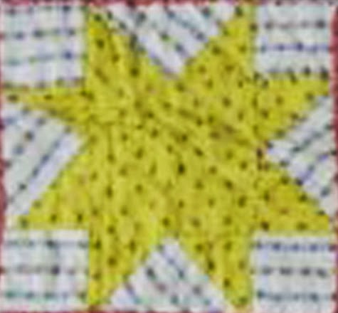
Vintage indigo star print
The simple figure here is a five-pointed star, a flag print.

Vintage block from 1875-1900

These little stars in white on indigo blue were fashionable after the Civil War but you also
see them earlier. I saw them referred to as "flag prints" in an 1875 catalog from Montgomery Ward.

Vintage quilt date-inscribed 1846 A.B. Ruby

Vintage block from 1875-1900

Two reproduction star prints from Moda,
Left: Old Glory Gatherings from Primitive Gatherings:
 Right Lexington by Minick & Simpson

Cathy's vintage top pictured on Cyndi's blog

The stars are set with sashing of a flag print barely visible here at the bottom.
Hard top to date because the prints are such classics.

Vintage block about 1880-1900
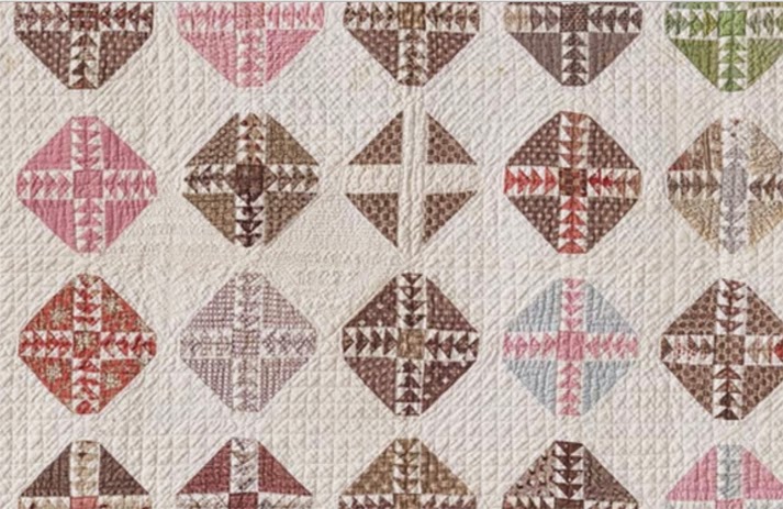
Orange madder-style prints and complex indigos.
This woman loved pattern.

We'll return to indigo when we go towards the end of the 19th century, the heyday of indigo prints. The dating rule is: The more variety in the indigo prints the closer to 1900.

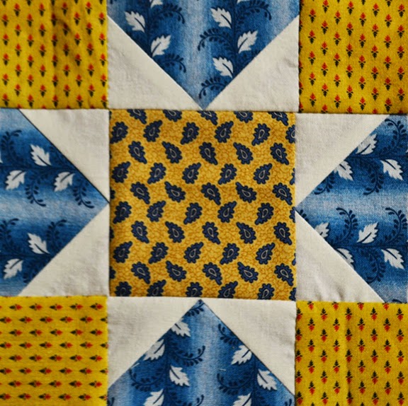
Reproduction star by Becky Brown with 
3 indigo prints and 1 shirting

Another style change towards the end of the century: quiltmakers liked to combine indigo ground prints with prints in other colors.

Vintage block about 1890-1920

These later indigos with a variety of figures are more fun to make so you might copy them now.

Vintage stars about 1890-1920

Gretchen's Reproduction Cheddar Block
The indigo  and chrome repros really capture the late-19th-century look.


Vintage block about 1890-1920

Older block, a single, simple print

Reproductions

Reproduction quilt by Julie Hendrickson, Blue and Brown quilt 
from History Repeated I.
The triple dot is the perfect mid-century indigo.

Two simple figures in half-drop, diagonal repeats by
Nancy Gere. Good for early indigo reproductions.

Indigo Revival from Minick and Simpson
who often do indigo reproduction prints.

Spinning Stars by Minick and Simpson using their Lexington line

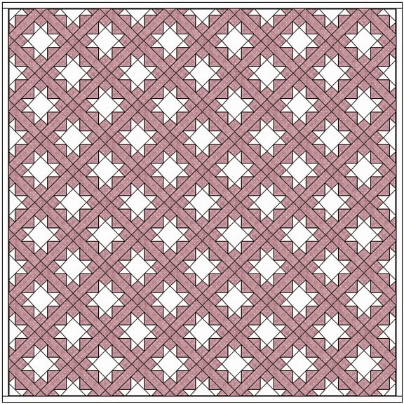
Setting idea for your stack of star blocks: 
A Border of Stars Set on Point

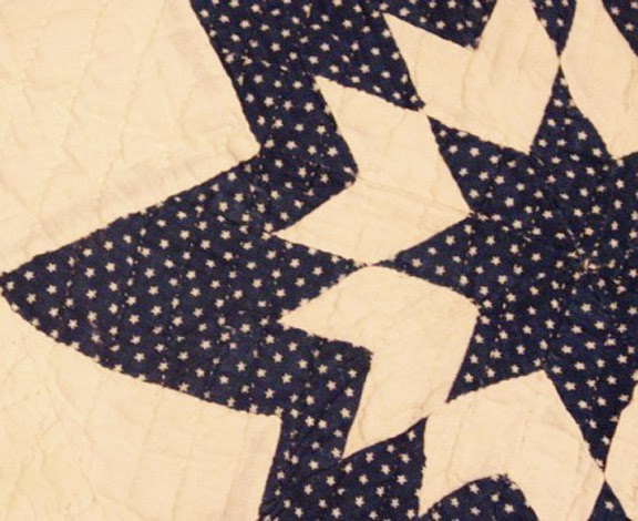
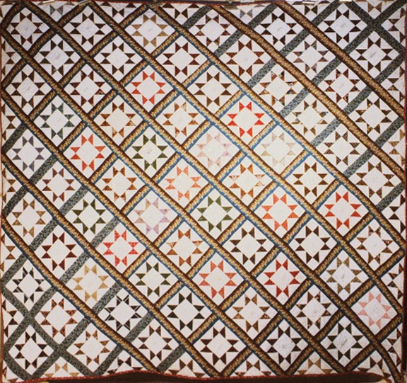
Vintage Quilt dated 1822 by Fanny Hurlbutt.
Documented in the Connecticut Quilt Project. Photo from the Quilt Index. 
See the full strip quilt here:


Kathie Ratcliffe, detail of Leesburg, one of her miniature quilts
 in the Star of Bethlehem design.

Kathie Ratcliffe, Star of Bethlehem

Bettina Havig, Peace Haven
Match the setting triangles to the star backgrounds and
the stars float.

Connie Chunn, Mary's Harvest, 2006
A great finish to a tiny medallion.

Sue Garman, Ancient Stars

One More Thing About Indigo Blue

Indigo prints have been popular around the world because the dye process, while complicated, is reliable and produces beautiful, durable results. Indigo dyers created pattern on cotton in two primary ways. 

Samples from the IQSC's exhibit Indigo Gives America the Blues Timeline.

One method is to use a resist to produce a figure, what we might call a batik. A thick substance (wax or paste) is printed on the fabric which is then dyed in an indigo bath. When the paste is removed:  a blue ground with a white or pale blue figure. Resist Printing above.

The other is to dye the cloth blue and then apply a discharging chemical that bleaches out the figure. Discharge Printing above.

I am relieved to know most experts say it is very hard to see the difference between these two processes, especially with the industrial printing in the second half of the 19th-century. Sometimes it's obvious, but don't worry that you can't tell which is which in an old print. (If it's a new print it's screen printed---unless it's a true batik.)

See a great online exhibition on indigo dyeing at the International Quilt Study Center and Museum's website at Indigo Gives America the Blues.

Symbolism in an Abolition Quilt

$
0
0

Detail of a British wool quilt, perhaps made
by a recovering soldier in the 1850s.
How many stitches per square?

Historians caution that we often read symbolism in old artifacts that was not intended by the maker. Another error is in interpreting that symbolism in the context of our era. We tend to ignore or be ignorant of the culture of the past.

In quilt history people make many assumptions in the areas of slavery and Civil War quilts. So few quiltmakers left any written record of symbolic meaning in their quilts, but so many meanings have been attached to them.

For example, story tellers like to attach tales 
of mid-19th-century runaway slaves to this sailboat pattern, even though
the pattern is a definite mid-20th-century design.


Broadside for an Anti-Slavery Fair in western New York, 1849

Letter from Margaret Brachen published in the Liberty Bell

One example of actual written evidence for symbolism is in a letter from a woman named Margaret Brachen of Halifax, England, in West Yorkshire. She wrote to Maria Weston Chapman, the power behind the Boston area abolition fairs that raised funds for the antislavery cause. Chapman published the letter in the Report of the 24th National Anti-Slavery Festival in 1858. 

I first saw the letter published in
the New Lisbon Ohio Anti-Slavery
Bugle, March 13, 1858

Bracken or Brachen wrote the letter on October 13, 1857 describing a "patched bed-quilt," she'd shipped for the Christmas, 1857 fair.
"Whilst sitting at my work, I thought there must be as many stitches in my quilt as you have slaves in America, and I counted the stitches in one row, and found them to be on an average twenty-five, and each square having four sides, made one hundred ; there are three squares in a box, and thirty-five boxes in width, and forty-two in length, so that it was a simple question in multiplication, the simple result of which is, that there are about twenty times as many slaves in America as there are stitches in my quilt...."
After a reflection on recent uprisings in the British colony of India she went on:
"One other thought suggested by my quilt I had almost forgotten. You will see that the lights and the darks and the blacks are all arranged so as to act, or rather harmonize, in concert; and so M'ould the races..."
Bracken then made suggestions about ending slavery by writing kind letters to slave-owners asking exactly how much money each would require to release their bondspeople.
"When an old woman has patched a quilt, she longs to tell some of the thoughts which occupied her mind during the progress of the work."
Maria Weston Chapman (1806-1885)
Collection of the Boston Public Library

Chapman added a footnote:
"This wonderfully beautiful proof of patient industry and profound sympathy for suffering humanity is henceforth an heirloom in the family of Mrs. Bracken's American correspondent..."
They bought the quilt for Bracken's value of 6 guinea (about $350-$400 today.)


Box but no squares

We have no idea what Margaret Bracken's quilt looked like or where it is today, but we can imagine it was pieced of squares into a box pattern, perhaps like some the quilt at the top of the page or below. 

Squares in a box?
Oops---I am imagining too much from the descriptions. I should be content with not knowing.

We may need to imagine the pattern but we needn't imagine the symbolism because Margaret Bracken's thoughts have survived in print.

See a scan of the Report of the 24th National Anti-Slavery Festival at Internet Archive: 

Stars in a Time Warp 9: Chrome Yellow

$
0
0
Reproduction star block by Becky Brown

Reproduction star block by Becky Brown

Chrome yellow is lemon-colored, an intense yellow with a slight greenish cast.

Vintage block, mid 19th century

Here's a copy of that block that I made. I even had the same chrome yellow print in a reproduction.

Vintage applique, mid-19th-century
That must have been one popular print.

Vintage quilt 1880-1910 detail


Vintage top 1830-1860

You can find the color in early 19th century quilts. The mineral dye process dates back to the 1810s.

The chemistry for chrome orange and chrome yellow
is quite similar. Above, a New York quilt dated
1859-60 includes both colors.


Vintage quilt 1840-1870

Vintage quilt 1840-1870

Chrome yellow became quite popular with quilters about 1840, when the colors of German folkloric arts were adopted for quilts.

Vintage quilt 1870-1910

The shade continued popular  through the end of the 19th century.


Vintage quilt 1870-1900

Vintage  top 1890-1920

A swatch from William Crooke’s 1882 manual on prints and dyes showing
chrome or canary yellow stripes.

Vintage chrome yellow prints
Chrome yellow prints---often the same print over and over--- became known as oil-boiled calicoes after 1880 or so. (Oil-boiled refers to an obsolete step in the printing process.)

We might consider these 1880-1930 prints
a reproduction of the 1840-1880 style.

Quilters in southeastern Pennsylvania bought many yards.

Block by Carrie Hall, probably made about 1930, in Spencer Museum of Art collection.
Hall used nostalgic reproduction prints to get the traditional color scheme.

Ann Hermes has this end-of-the-19th century
quilt for sale in her Etsy shop.


Reproductions

Reproduction block by Becky Brown in
chrome orange plain and chrome yellow print

A reproduction of a reproduction from my collection 
Old Fashioned Calicoes

Dawn Cook Ronigan's reproduction
miniquilt, donated to the AQSG auction last year.
She emphasized bright chrome yellows and chrome oranges in her reproduction palette.

Reader Valerie's green and red blocks backed by reproduction
prints from her chrome yellow stash.

S.F. used chrome orange and chrome yellow.

Reproduction chrome yellows

Judie Rothermel from Party of 12

Chrome yellows don't sell as well as reproduction blues and madder browns so good repros are sometimes hard to find. You need a collection of prints and solids in your stash.

Recent line: Touch of Baltimore from Little Quilts

Reproduction Star by Bettina Havig

You see a lot of chrome yellow solids in antique applique.

Vintage applique quilt dated 1858

 
Moda's Bella Solid 9900-131, Lemon, is a good match
if you are looking for a canary solid.

What to do with Your Stack of Star Blocks
More Ideas for Alternate Applique
 Buy these patterns. Adapt them for 6" blocks.

Here's an excellent idea for alternate applique from 
friends Alma Allen, Jan Patek and Sue Spargo who
included "Cottage Flower" in their 2000 book Simple Pleasures

A Cottage Flower block by Karen at Log Cabin Quilts,
who did a lovely job with classic prints pushed to low values.


Froncie Quinn at Hoopla reproduced a 
quilt by Florence Peto from the 1940s in which 
simple applique alternates with nine-patches.
Why not stars instead of nine-patches?
See the Calico Garden here:

Peto's original used some Chrome Yellow reproduction
prints.


Lisa Bongean at Primitive Gatherings designed her own version of Peto's quilt:
 Lisa's Flower Garden
with her ideas for simple applique and color.

 Lisa's Flower Garden

One More Thing About Chrome Yellow


Chrome yellow cottons were produced in England but mainly for export. Chrome dyed fabrics, especially the solids and the brightest prints, seem to have been sold in the United States primarily for quilts. 

In her research for the Ohio Quilt Project, fashion historian Virginia Gunn found an 1849 advertisement for dressmaking drygoods, such as printed lawns and ginghams, with a separate category: “Green and Yellow Prints for Quilts.” Yellow and gold solids are not found in American clothing---gowns, shirts or baby outfits. Gunn wrote that any “solid-colored cotton was little used as dress fabric.” 

In 1842 a Baton Rouge merchant offered
"French, English and American calicos, a variety of patterns, red, blue and green,"
probably aiming at that same quilt customer.

Drygoods store in Minnesota, about 1900

See another post about chrome yellow here:

Palmyra Mitchell's Patchwork Flag

$
0
0
Calico Flag by Linda Frost, 1997
18-1/2" x 31"

Linda made this flag as a sample for my 1997 book
Quilts from the Civil War. 


Co-author Terry Thompson and I had found a fragile
old calico flag in the Weston Historical Museum. We couldn't get
a photo of it so we made several copies.

Linda's looks very much like the original which 
was pieced of Turkey red stripes in two prints.

Palmyra's was reversible and had tabs stitched to it.

Palmyra Mitchell's family recalled the flag's story when they donated it.

Palmyra and John W. Mitchell lived in Union Mills, a town on the banks of the Platte River, which winds through Platte County, Missouri. The town was flooded out long ago.

The Platte in Missouri is not quite "a mile wide and a foot deep" as it is along the Oregon Trail in Nebraska, but the river often claims anything built near the channel.


The only site left is a cemetery with many Mitchell
family member's graves.

During the Civil War the Mitchells held Confederate sentiments, like their Union Mills neighbors, many of whom were Kentuckians. But Missouri was a Union state and federal soldiers demanded to see the Miller's Union flag. When none could be produced the troops told them they'd be back soon. If no flag were hanging they'd burn the house.

Union troops marching by a Native American family's cabin
in Missouri. Drawing by Alexander Simplot for Harper's Weekly.

Palmyra ran to the scrap bag and found enough red, white and blue fabric to make a small flag. She quickly pieced thirteen stripes of Turkey red calico and white with a field of a large white star surrounded by thirteen smaller stars.

The flag was reversible and on the side---the edge with the stripes and not the stars--- she added two loops for hanging. When the Yankees returned the flag was on display and the Mitchells' home was spared. The loops indicate that they flew it upside down with the stars at the bottom, but the Yankees seem not to have noticed her small rebellion.

I haven't been able to find any more about Palmyra Mitchell. There are records of a John W. Mitchell in western Missouri who died in 1879 leaving a widow Pattie and children: Hattie B., Mary B., Carrie L., Alex. R., Julia.
And one who married a Syntha Mullins in May, 1852.


Linda and I are selling the model calico flag made for the book at my Etsy Shop. Click here for more information.
https://www.etsy.com/shop/BarbaraBrackmanShop

See more about the Weston Historical Museum in Platte County, Missouri.
http://www.westonhistoricalmuseum.org/Museum.html

Stars in a Time Warp 10: Green Calicoes

$
0
0
Vintage block about 1900
Green calicoes in these small ditsy prints were dyed in the same fashion as the overdyed green solids discussed in this post:

Vintage block about 1880-1900

Blue and yellow dyes were layered to get greens, blacks and yellows.

Reproduction block by Becky Brown
Green calico stripe, chrome yellow and a shirting print.


Rosemary did this star last year in the center of 
block from Threads of Memory

Vintage block about 1880-1900

A classic ditsy overprinted green calico.
Ditsy is actually jargon in the textile business for a simple print.

Vintage quilt about 1890-1910
End-of- the-century quilters loved it for sashing
and settings. They thought it went with everything!

Vintage quilt about 1880-1910


Vintage quilt about 1880-1910
Eastern Pennsylvania stitchers loved it right next to pink.

Vintage quilt date-inscribed 1894

You don't find much of the bright green calicoes in quilts dated before 1840s.

Quilt date-inscribed 1833 by Mary Marden in
the Nickols Collection at the Mingei Museum.

There were plenty of green prints in the early 19th century quilts, but in general they were quite different: more complex colors, more complex prints.


Quilt dated 1841

Reproduction blocks by Bettina Havig

A look Bettina is capturing in these two greens.


Detail of a mid-19th-century quilt from the D.A.R. Museum

The fad for bright green calicoes may derive from the Pennsylvania-German aesthetics. Bright green, red and yellows were a favored palette.

The fabric was a favorite with the ethnic German women
of Eastern Pennsylvania. This vintage quilt combines the primaries,

Edyta Sitar's interpretation of the palette for her Laundry Basket quilts

A difficult thing to do!

Reproductions

Valerie's block for green solids included a green calico center.

Green repro from Windham's Calico Garden line
Like the other bright calicoes good green repros are
hard to find.

From a Rocky Mountain Quilt Museum collection of repro prints.

From Nancy Gere's Poison Green

Susan Martin did a great job of copying the vintage quilt at the top.
Her green is perfect.

Mary Freeman and the Patchwork Divas
use a lot of green calico and punch it up a little.


Jo Morton, Berry Nice
You might prefer to interpret the green rather than copy the color scheme.

Fabric and pattern from Pomegranate Lane 
by the Quilting Crow

Push the color to a more olive or grayer shade.

Here are some toned-down green prints from my
Metropolitan Fair line a few years ago.


What To Do with Your Stack of Star Blocks?
Set them Fence Rail Fashion.

Vintage quilt documented by the Heritage Quilt Project of New Jersey,
Photo from the Quilt Index

Lori at Humble Quilts was inspired.
See her tutorial for the set here:
http://humblequilts.blogspot.com/2010/05/strawberry-fields-finale.html

Vintage quilt 1870-1890
The zig-zag or fence rail set is one you see more after 1870 than before.

Set the stars on point with triangles, piece those into strips and offset the strips.

Here's a quilt I used to own that is older, maybe 1830-1860,
set in zig-zag fashion. The strips are paralleograms---strips with
angles on the ends.

Similar to this beautiful mid-19th-century reproduction by
Moda using Howard Marcus's Collection for a Cause: Hope.

Again, here's how it's stitched.

The star here finishes to about 9-1/2"

See the free pattern atModa:

For a 6-inch star cut the squares 9-3/4" for the setting triangles and cut into 4 triangles with 2 cuts.


I tried once to construct this set with rectangles and squares.
I was not pleased with the results.

Here's an updated look by Mabry Benson.

Another at Thread Head:

One More Thing About Green Calicoes

Detail of a vintage quilt from the collection of the Winterthur Museum.

This overprinted classic print is NOT Poison green although that is what many call it today.

I wrote a post about the real poison green five years ago:
http://barbarabrackman.blogspot.com/2010/01/poison-green.html

There definitely was a poison green: green dyes and pigments based on copper arsenate---arsenic.

Carl Wilhelm Scheele died of poison green at 44.

"Chemist Carl Wilhelm Scheele (1742-1786) discovered arsenic's use as a coloring agent in 1778.
Variations became extremely popular for dyeing and printing cloth and wallpaper and, worst of all, for food coloring. Before pure food and drug laws the only testing was trial and error on the part of the consumer. Decades went by before people realized that coloring marzipan with copper arsenate was an extreme health hazard. Wallpaper and silks also could sicken, if not kill."

The over-printed calicoes with their chrome yellow figures may have been somewhat toxic, but no where nearly as dangerous as the true arsenic green.

See more about green calicoes here:
http://barbarabrackman.blogspot.com/2011/07/green-calicoes-antique-prints.html

A New Jersey "Union" Quilt

$
0
0
Applique Union quilt, attributed to 1858-1860

I recently bid on this unusual patriotic quilt in an online auction (and lost.) I was intrigued by the pattern, a repeat of five appliqued star blocks.

And particularly by the inscription repeated four times
in the center block.

"Union
Presented to Rev C.K. Fleming
By the
Youth of Pemberton"

Was it a Civil War quilt, made during the war years?

I analyzed the fabrics, style and quilting visible in the photos. 

There were photos of three fabrics, plain white cotton (no clue at all), a multicolored Turkey red print---a good clue to about 1840-1870, and a blue on blue print (not as much help but quite popular in the 1840-1880 era).

 The style---applique blocks on point---also quite popular in the 1840-1870 period.


The quilting---it's hard to see in the photo but I was a little concerned about the minimalism in the quilting and particularly that single cable in the sashing. The single cable is a rather weak clue to the 20th-century but I really would have to see this quilt in the cloth to determine when it was quilted.

The condition---The Turkey red was fracturing as it often did, particularly near the edges. The ink had bled making the words difficult to read and it need a careful cleaning.

I bid on it, and while I was waiting to be out-bid I did a little work on the social context to see if that would help in dating it. It was easy to find the Rev. C.K. Fleming.


Caleb K. Fleming (1824-1896) was a Methodist minister in New Jersey. In the days when Methodist preachers spent two years at each post he spent 1858-1860 in Pemberton. New Jersey.

"The Sunday schools... had, in 1860, three hundred and seventy-five children."

The 1860 census found him in Burlington, New Jersey, as a 31-year-old Methodist minister, married to Emma with two children Hannah (6 years-old) and baby John.

Pemberton, New Jersey about 1910

The quilt top, probably made by his Sunday school scholars in Pemberton, most likely dates to 1860, a gift for a departing friend. It may have been quilted later. Technically it wasn't made during the Civil War, but it certainly reflects pre-Civil-War partisanship.

I was quickly outbid. The quilt sold for a little over $400.

More about the man:


Rev. Caleb K. Fleming, late of this city and county. father of John R.Fleming, was born near Bridgeport, N. J., August 30, 1824. He was the son of John and Abigail Fleming and of Quaker descent. He was a farmer’s son, and his school days were limited. having only one winter at the Seminary. He was converted at a Methodist altar, baptized by Rev.J. K. Shaw and united with the church at Paulsboro, where his parents then lived, January 31, 1840. While a student at Pennington he was licensed as an exhorter by Rev. Joseph Atwood, and as a local preacher by the Swedesboro Circuit. He was received on trial in the New Jersey Conference at Salem, April 21, 1847, and was ordained by Bishop Janes in 1849. He married Emma H. Stanger, of Glassboro. April 30, of the same year. During the fifty years of his ministry he served the following charges: Glassboro; Kingswood; Moorestown; Medford; Broadway, Camden; Pemberton, Burlington, Sharpstown; Broadway, Salem; Millville, Bordentown; Tabernacle, Camden; Bridgeton, New Brunswick; Port Republic; Ocean City; Mays Landing; St. Paul's, Atlantic City; and Pleasantville. He was a much loved and successful minister. Many souls were saved and churches built up by his efforts. He never spoke from notes, and his sermons were of the plain. sympathetic, Gospel order. He filled some of the best appointments in the State. and was a devoted husband, father and friend.
For his second wife he married Ann C. Collins, of Port Republic, April 28, 1892, and became a supernumerary in 1895. He died suddenly of heart failure while attending the Pitman Grove Camp Meeting. August 3. 1896.

Read more about C.K.Fleming here at Google Books:

Catherine Fisher's 1862 Quilt

$
0
0
Detail of a new acquisition in the collection of
Boston's Museum of Fine Art
#2013.74

See the whole quilt at their website by clicking here:
http://www.mfa.org/collections/object/pieced-civil-war-quilt-567395

Dealer and collector Gerald Roy found this quilt in New Hampshire. According to the MFA catalog the inscription (barely visible in the quilting above in the center) reads: "Our Father Who Art in Heaven" and "Christian A. Fisher 1862". Catherine Fisher of Muskingham, Ohio, is presumed to have made it for her son when he enlisted in the Ohio Volunteers.

Catherine Krebs (1809-1896) and Caspar Fisher/Fischer (1808-1893) came to the United States from Bavaria in 1837, soon after their marriage. Their eldest child Samuel was born in Pennsylvania in 1839. They soon moved to Adams Township, Muskingum County, Ohio, where eight more children were born. Christian, born in 1843, was 19 the year the quilt was made.

The Fishers attended the Zion Lutheran Church
in Adams Township. This building was finished in 1873.

The Fischers had lost two young children in 1861. Three-year-old John died in September and seven-year-old Casper in October. Fear for her boy must have been foremost in Catherine's mind during the War. Fortunately, Christian survived the Civil War and settled in Plymouth, Indiana, where he died in 1919 at the age of 78.

Christian Fisher's grave in Indiana.

Stars in a Time Warp 11: Purple

$
0
0
Reproduction block by Bettina Havig

Vintage block from the last half of the 19th-century. 
Mary Barton collection.
Picture from the Quilt Index.

Reproduction block by Becky Brown

Vintage quilt, 1870-1890

We've been making some vivid blocks in the first ten
weeks of the QuiltAlong, so purple reproductions will
be a change.

Some of Bettina's blocks


Much of the purple we see in quilts from the 19th century is muted. 


It may have left the mill quite bright but light seems to have a strong effect on the color, fading it to brown.

Vintage block from a quilt in the collection of the Benton County (Oregon) Museum

Here's a brownish swatch removed from an old top.
Notice the tiny strip of brighter purple in the seam at the bottom.

Sometimes you find a swatch that hasn't really seen the light of day because it's tipped into a book (glued into a book).


Swatches tipped into Persoz's 1845 dye book

How purple were all these purples at one time?

Vintage quilt about 1880-1900

Vintage quilt, perhaps 1870-1890

You can see the purple setting squares fading on the fold lines.

Mid-century quilt from Judy's Antique Quilts.
This one's held up well.

Vintage block from the early 19th century. 
Collection of Old Sturbridge Village.
Again this early block may be vivid because it was kept in the dark.

Faded or not, lilac makes a nice contrast to the brighter colors of the time.


One often finds the purples mixed with madder reds, browns and oranges.

My guess is that the purple is from logwood dye, which worked well with the madder mordant-dyeing method, or it may be that madder itself could produce the color.


Here's a bolt label or cloth label from the collection of
the American Textile History Museum:
Madder and Lilac together.
Read more about labels at their site:

Reproductions

Reproduction North Star block by Heidi/Cranberry Chronicles

Purple grounds in chintzes go back to the 18th century. For the mid-19th-century you'll probably want to stick with monochromatic prints.


Judie Rothermel reproduction
And you have to decide how purple you want to go.
Should it be purple as it came off the bolt?

Paula Barnes, Companions

Or purple as it appears today?

From Betsy Chutchian's Wrappers

Judie's Authentic Minis

Terry Thompson's Merchants Wife

Some purples suitable for mourning prints from my 
Civil War Jubilee collection for Moda.
I found this color in a swatch book---not exposed to light.

Reproduction block by Becky Brown with purples from that line.


You see redder violets too as in this Collection
for a Cause Mill Book 1892 coming soon.


And look for purples mixed with madder shades.

From a Shelburne Museum collection

What To Do with Your Stack of Stars?
Build a square around your block.


Grandma Laurel's blocks-
Fabrics: Dancing in the Rain 
from Edyta at Laundry Basket Quilts with
some bronzey-browns

Turn your stars on point and add triangles to the edges.
Cut squares 9-3/4" and cut each into 4 triangles for a 6" block.


Top by CottonCharmQuilts-
Fabrics: Wicasset from Minick & Simpson

Both tops above were made from the Schnibbles pattern Madeline from Carrie Nelson of Miss Rosie's Quilt Company (Carrie now blogs for Moda, YAY!) See her at her new job here:  http://blog.modafabrics.com/


This set is particularly good for sampler blocks that are not the same size. Make the corner triangles extra-large and then trim all the blocks to the same size later.

Another way to get the same look is to alternate x blocks with the stars.

Battlefields from Country Threads

One More Thing About Purple
British Plate-Print, about 1780
Winterthur Museum #1960.85
"printed in purple but now brown." 
See page 214.

Linda Eaton's new edition of  Printed Textiles: British and American Cottons & Linens 1700-1850 from the Winterthur Museum emphasizes the fugitive nature of purple colors. The catalog focuses on furnishing fabric and shows numerous examples of furnishings "printed in purple but now brown." Drapes and bedspreads are usually exposed to more light so more apt to fade, but I am having a hard time imagining all these lovely browns being an even lovelier purple when new from the mill. I'm going to have to change my thinking.

You need to own Eaton's new Winterthur catalog. It's the current last word on Printed Furnishings.

Read other posts I've done on purple:

Becky's Spiky Set for Threads of Memory

$
0
0


Becky's finished top in line for hand quilting

She says that probably is not going to happen, however. She can piece a lot more tops than she can quilt. The quilt in the frame has been there for 20 months. She sent this photo to show how she photographs her quilts (note rolled up rug.) She hangs over the stair railing to get the whole quilt in a picture and then manipulates the photo into a rectangle with Photoshop (at which she's quite good)
.
 Memory's Crown by Becky Brown, 76" 99"

For her blocks made with my Moda Ladies' Album collection, Becky used a set inspired by the old Rocky Mountain/Crown of Thorns/New York Beauty sashing.


Quilt from the mid-20th century, possibly made from a 
Mountain Mist pattern called New York Beauty.

We're giving you a pattern here but must remind you that this is NOT for beginners in sewing or in computer-aided pattern drafting. It's a challenge.


Becky pieced spiky strips 12-1/2" x 4-1/2". When pieced to the blocks they finish to 12" x 4".


 Each spike is tapered from 1" on a 4" length.

Threads of History blocks with a Crown of Thorns set#1, 
52" x 68"

Becky did a lot of preplanning using Photoshop. Her first idea was to set the 12 blocks on a horizontal grid and sash the blocks with the 12" x 4" finished strips. This is the pattern we are giving here.

(This shot is probably the closest to the correct color of this quilt.)

Plan A: Separate the blocks with these strips and add a finished 4" corner square of a large floral print. Most prints she used are from my Ladies' Album collection last year. Her light plain color in the spikes is Moda's Bella Solid Parchment.


Measurements
  • Top is 52" x 68".
  • Blocks finish to 12".
  • Cornerstones finish to 4". (Cut 20 squares 4-1/2".)
  • Pieced sashing strips finish to 12" x 4". You need 35.
Here's a paper pieced pattern for the strips.


How to Print
  • Create a word file or a new empty JPG file that is 8-1/2" x 11".
  • Click on the image above.
  • Right click on it and save it to your file.
  • Print that file out on a sheet of 8-1/2" x 14" paper (legal-size). The template should be 4-1/2" wide x 12-1/2" long.
  • Adjust the size if necessary to the correct size.

Cutting the fabric.
Becky used a template to cut her fabric
before piecing it to the foundation.

Print this on an 8-1/2" x 11" sheet of paper.
It should make a template 1-3/4" at the base.
You may have to readjust the pattern to fit your printer.

Here she's cut 36 spikes out of a strip of Parchment solid fabric.

Note from Becky: "When piecing this border be mindful of starting and ending the sashing with light or dark fabric. 

It will make a difference."

Plan B: Set for 12 sampler blocks with 6 alternate plain blocks.

But she started thinking that she should place the blocks on point. The top would finish to about 68" x 90-1/2"


Piecing all those spikes gave her more time to think. She decided the cornerstones would look good with a pieced diamond star, something you often see in the sashing of those old Crown of Thorns quilts.

4" finished, hand-pieced star

Stitch 17 stars finishing to 4". You are on your own here. Draft an 8-pointed star to finish 4" ---BlockBase or EQ7 will do that for you. Becky hand-pieced them for accuracy.

First idea for star/sunburst

Well, you know Becky. She got another idea and she can sew anything she can think of and
draw in Photoshop. She decided those six plain blocks were just too plain and put an 8-pointed star/sunburst in them.

" I wanted these stars to float in the block so that it wouldn't compete with the other blocks. The placement of fabrics (colors) vary on these 6 blocks so they are all different." 

Again, you are on your own. (Do note there are many nice star/sunburst blocks already drafted for you in BlockBase and EQ7).


Detail of a corner to show you how she finished up the border.

And there you are. 
Note: No pattern for finished Becky masterpiece. It should remain one of a kind don't you think?

Quilt Causing A Crisis of Community

$
0
0

A Crisis of Community: Trials and Transformation of a New England Town, 1815-1848,  is based on the extensive diaries of Mary White of Boylston, Massachusetts. Author Mary Babson Fuhrer does an impressive job of linking changes in New England's culture to events described by Mary Avery White and her neighbors.
"This account of Boylston, Massachusetts over three decades of wrenching change tells the dramatic story of how a social order that was founded by Puritans in the 17th century, and that managed to survive the upheaval of revolution and the creation of a republic in the 18th century, came apart unexpectedly in the course of a single generation during the 1820s and 1830s." Robert A. Gross, University of Connecticut.

The First Congregational Church in Boylston

White's diary and Fuhrer's book reveal how an antislavery quilt became the focus of  dissension in Boylston as conservative and liberal groups argued over religion, slavery and women's roles. Although older than many of the women in the more radical group, White was an enthusiastic agent for change.

Mary Avery White (1778-1860) 
Her diary is in the collection of Old Sturbridge Village

Parts of the diary have been published on line, particularly events dealing with White's antislavery activism.
Fri [Oct] 4 [1839] ...I attended the lecture in the evening Caroline & myself assisted in getting the bed quilt at the Hall for the Antislavery cause.

See that link here:
http://www.teachushistory.org/second-great-awakening-age-reform/resources/mary-white-diary-entries-antislavery-activities

Mary Babson Fuhrer's book cover has the
image of this abolitionist cradle quilt with an antislavery poem.
It's attributed to Lydia Maria Child.
Collection of Historic New England.

White was one of the antislavery activists who expressed political opinion through needlework. She was a founder of the Boylston Female Antislavery Society whose members met to stitch needlework to donate to the Boston Antislavery Fair, including a crib quilt and a bedquilt in 1837. The larger quilt was described by one of the Boylston woman as a bedcovering that "none but an Abolitionist would buy." Their quilt, which has not been identified, may have been similar to the Everettville, Massachusetts quilt inked with abolitionist sentiments.

An antislavery quilt by the women of Everettville.
See a post here:

But there was a split in Boylston and Boston too, primarily over how active churches should be in the antislavery cause. Divergent views became dissension. As Deborah Chapman recalled in a letter to her sister Ann:
"about the time of our fair....[a] Bed quilt was made up there [in Boylston] and quite a dreadful fight they had about it."

The Town Hall
Boylston

Two antislavery fairs were planned for Boston. To which would the quilt go? A member of  one group was heard to say that if the quilt was intended to raise money at the other group's fair, "Every stitch which they set (and they had set a good many) should come out."

A fundraising fair in the 1860s,
raising money for the Union.

The story continues that the quilt went to the more radical Boston fair where it was purchased by William Lloyd Garrison himself. The Bolyston Female Antislavery Society split into two different organizations just like the Boston society.

Fuhrer's book is a great read for anyone interested in early 19th-century women's lives and New England society and religion.

Stars in a Time Warp 12: Foulards

$
0
0
Star by Becky Brown
A foulard print in the center square and 
red points contrasted with a tossed floral.

Rather than focusing on color and dyes for a while we'll look at print style. Foulard-style prints were particularly popular for clothing in the 1860s.

Bettina Havig
Foulard or offset prints in both star and background.

Vintage top about 1840-1860.
The two simple madder reds on the left are figures printed in an offset repeat.

Classic 1860s fashion

These dresses may be printed wools---delaines.
 The off-the-shoulder look above means
she's still considered a girl rather than a woman

A similar girl's dress

Another way to describe the set style is an isolated figure in a half drop repeat

There are many terms for the staggered repeat.
When the figure is circles we call them Polka Dots.

Vintage quilt, 1850-1870
We see a lot of foulard sets in the printed wools of the mid-19th-century.

Vintage cotton quilt, 1850-1880

Vintage quilt, mid-19th century

Vintage quilt, mid-19th century, found in Minnesota Project.
Picture from the Quilt Index.

That diagonal grid can really define a look. If you are interested in mimicking mid-19th-century quilts you need reproduction foulards in the scrapbag.

Patatelier on her blog:
"I never saw a foulard I didn't like."

The exaggerated print scale and pose may
mean this is an actress in a stage costume.

Reproductions

Here's a little repro quilt Jan Schultz did in 2008,
bordered with a madder-style foulard.


I have a new collection for Moda called Alice's Scrapbag, coming out as yardage in September, 2015.
Alice had many foulard-style prints in her 1850s scrapbag, including this paisley cone. The original is on the left; the redder one is the reproduction.
See more about the collection and its foulards here:

Two of my older repro prints in madder-style shades.


Above and below from Circa 1825 collection by In the Beginning


A classic green from Judie Rothermel's New Colonies

Foulard from Red Rooster

The offset figures can really catch your eye. In Marsha McCloskey's star
quilt the blue off-set print should be background but dots demand your attention.

The latest Collection for a Cause with two classic foulards.


Ann contrasted two foulards with a seaweed or coral repeat in the background
for her North Star.

Valerie used a foulard for the background and a tossed paisley for the red.

A tiny quilt by Kathie Ratcliffe making good
use of foulard-style madders. Kathie really understands the
way seamstresses used fabric in the 19th century.

What To Do with Your Stack of Stars:
Set Them in Half Drop Fashion

Quilt dated 1864 by Octavia Lewis
Maine State Museum
The staggered repeat was so important to mid-century design that it was a favored set for quilt blocks too. 

Vintage quilt, 1840-1880
Particularly in applique.


Set your star blocks on point to create a foulard-style set.  I did some sketches in EQ7 using the On-Point Layout for 6" blocks.

Dark stars with light backgrounds set on point....

or light stars on dark backgrounds.
If you really want to emphasize the diagonal grid add sashing between the stars.

Dark stars on light backgrounds with 1-1/2" sashing
This is how Octavia Lewis got the look in the field of stars
behind her flag above.

1-1/2" sashing
(Proportion in the sashing is one quarter the block size here.)
The wider the sashing the more isolated the star.

3" sashing
Here's a sashing half the size of the blocks.

Insanity, pieced by Barb Heetland, 
quilted by Judy Wehrspant, Milford, Iowa

Barb made 4-1/2" stars and set them
with alternate plain blocks. It's a different block but
when set like this it makes the same old-fashioned, diagonal grid.


Judy's machine quilting is terrific.

One More Thing About Foulard-style prints

Women modeling traditional French clothing.
National Geographic.

Foulard is a French word that has come to mean not only the print style but clothing traditionally made from the patterned fabric.


A foulard-style necktie.


In recent decades foulards came to define the "Preppy look."

So---are you going to make a box labeled Foulards
where you keep these spotty prints sorted by style rather than color?


For more about foulards see my book America's Printed Fabric, pages 68-71.

And a post about foulards in a Civil-War-era stash.
http://barbarabrackman.blogspot.com/2009/12/document-and-reproduction-prints.html

More about earlier foulard styles:
http://quilt1812warandpiecing.blogspot.com/2012/02/imported-prints-indiennes-mignonettes.html

Quilts at the Mississippi Valley Sanitary Fair

$
0
0
Women at the fundraising fair in St. Louis in 1864
Stereo photograph by J.A. Scholten

The Missouri Historical Museum has a vivid set of stereocards photographed by J.A. Scholten at the 1864 Mississippi Valley Fair, which raised money for the Union cause towards the end of the Civil War.

Women and children in the children's department booth
selling toys. 
The girl in the white cap is Nelly Grant, the General's daughter.

Patrons could purchase photographs of
her playing the old lady who lived in a shoe.

The collection has several photos of women at their tables selling all kinds of decorative items. In the lower right here the circular frame seems to be holding a hair wreath or a floral wreath of some kind.

Three women pose in the Bed Linen & Quilts Department

See the photo at the Museum's website
http://collections.mohistory.org/resource/144612.html

The Fair was documented in a publication The Daily Countersign, which is online at this address.
https://archive.org/stream/dailycountersign00brac/dailycountersign00brac_djvu.txt
"The Department of Bed Linen and Quilts ...purports to contain only quilts and bed linen, but shows a very fine assortment of sofa pillows and afghans, which would seem more properly to belong to the Fancy Goods Department. They are very elegant, of different patterns, dark and light, large and small. This department occupies two tables, one central and one at the side ; and the central one contains perhaps the most showy of its articles."

The photos are so sharp we can examine the bed linens for sale.
Afghans, needlepoint pillows and over on the left a hexagon quilt.

And on the far right another hexagon quilt behind some
crocheted or knit pillows. This quilt may be the one described in the Countersign:
"There is also a large woolen quilt, of the hexagon pattern, which is entered for the premium, and will also be raffled for, unless disposed of previously. Here one can certainly find quilts and bed spreads of all kinds — silk, cotton and woolen — for large beds, cribs and cradles, plain or highly ornamented."
When I looked at the Museum's site they had only a few of the Scholten pictures on line. But I found several others on Pinterest.

Another of the 54 booths, The Public Schools.  

Where they seem to have shawls and children's  clothing
for sale, and on the walls?
"The department had no room for wreaths and names in the background, for they wanted to display their quilts, of which they have an excellent variety, both silk and cotton. "We noticed, especially, the crib-quilt of the national colors, which always attract the eye. Two other crib-quilts, of different patterns and very neatly made, speak for themselves, and two large silk quilts fill up the remaining space."

The St. Louis Turn-Verein's booth (a German athletic club.)

You could have your fortune told at the Delphic Oracle booth
 right in front of the Bed Linen & Quilts booth.
"Here, surrounded by flaming symbols, the signs of the zodiac, and all other cabalistic characters, abides the Delphi Oracle, and turns the Wheel of Fortune. Approach slowly, and you cannot fail to feel the spirit of the place. Here, within the charmed circle of a table which bears fearful and mys terious signs, while the owl keeps watch above, presides the priestess, who, of course, must of necessity be the seventh daughter of a seventh daughter."

Stars in a Time Warp 4: Chrome Orange or Cheddar

$
0
0

Becky Brown
Reproduction block with Chrome orange plain
 and chrome yellow print

Vintage mid-19th century applique

Chrome orange is a color familiar to every collector of antique quilts.

Vintage quilt about 1870, photo from the Quilt Complex
Chrome orange in the stars and the stripes.
Read more about this quilt here:

Vintage quilt, probably Pennsylvania, end of the 19th century

After 1840 or so chrome orange in prints and plains was popular for piecing and a favorite accent to the reds and greens of appliqué florals. Towards the end of the nineteenth century and into the twentieth, quiltmakers in parts of Pennsylvania and the Southern United States considered the color the perfect background for appliqué and pieced designs.


Hexagon quilt mid-19th-century
Chrome yellow at the top and chrome orange at the bottom 
were closely related in chemistry.

Reproduction block by Bettina Havig

We'll make chrome orange stars this week, to use a name the dyers and printers used. 

William Crookes captioned this printed plaid "Chrome Orange Light and Dark"
in his Practical Handbook of Dyeing and Calico Printing,
published in 1874, 

Chrome dyes are mineral dyes, rather than vegetable dyes.

Doll quilt about 1850

Flying Geese quilt about 1840-1860


We call it cheddar today.

Vintage quilt about 1880
Polka dots (circular figures set in a diagonal grid)
were popular on chrome orange. The prints
are often quite simple.

Vintage Quilt, late 19th-century

Detail of an album sampler dated 1857.
It's called the Odd Lady Quilt, perhaps a
reference to the Odd Fellows or to the style where every block is different.

Vintage quilt, about 1880-1900
When shaded like this the Evening Star block loses its starry qualities.

You occasionally run across a complex chrome orange print,
here combined with chrome yellow.

Vintage quilt about 1880-1910

Kathlyn Sullivan collects Cheddar or Chrome Orange
quilts; many of them from North Carolina.

After the Civil War, Southerners opened fabric mills, some specializing in solid colors and plaids. Chrome orange plains dyed with the mineral dye were colorfast and inexpensive leading to a Southern regional style of solid color quilts featuring chrome orange.

Reproductions:


Antique Diva Pyramids (detail) by Diana Petterson from History Repeated

Using a lot of chrome orange creates a certain look,
style often seen in the quilts of the 19th-century Patchwork Divas group.

The color is so strong it's sometimes hard to find. Yellows don't sell
as well as blues or greens.

Repro Quilt Lover recommends Moda's Bella Solid
9900-152 called Cheddar.
See why she has two bolts here:

Reproduction quilt by Marcie at PatchaLot

Rosemary Youngs, Macaroni and Cheese reproduction, 2011

There are a variety of cheddary colors out there. Rosemary
seems to have a lot of this solid in her stash.

I think she used 4" blocks so she probably still
has a lot of chrome orange reproduction left.

Three chrome orange prints from Nancy Gere's Colonies: Cheddar and Poison Green

The PolkaDotChicken blog used a Moda dot from an old collection called Rooftop Garden.
That particular dot is probably tough to find now, but the point of this QuiltAlong is to teach you what to look for---bright orange background with white or brown/black dots.

Also look for bright cheesey-backgrounds with spaced-out figures.

Mercer County Star by Jean Stanclift used a chrome orange
and a chrome yellow from some of my early collections.

Star Puzzle by Jean Stanclift.
When we had our Sunflower Pattern Co-op
we were on a cheddar and blue roll.

Reproduction Star by Bettina Havig


Reproduction Star by Becky Brown

If the authentic cheddar colors are too much for
you remember you can use toned-down shades for
an interpretation of an antique quilt rather than a copy.
Go towards the pumpkin color or a brownish-gold.

Jo Morton's Spice Market

But even if you aren't comfortable with a true cheddary chrome orange
you should try it. As Becky says:

 "Cheddar/Orange is my least favorite color - until now - I have [the block at the top of the page] pinned up and can't stop looking at it, and loving it."

Setting Idea for Your Stack of Star Blocks
Alternate Plain Blocks on Point

Reproduction quilt by Carol Hopkins, 
Tribute to Judie [Rothermel]

Set the blocks on point with an alternate unpieced square for a very traditional look. Carol's used a few of Judie's 19th-century yellow-orange prints to move our eye around this composition.

Vintage quilt from first half of the 19th century,
Holstein Collection, International Quilt Study Center & Museum.

Reproduction quilt by Claire McKarns
Claire used a similar set for her 2010
AQSG Star Study quilt.


Reproduction quilt by the Women Who Run With Scissors
Years ago our sewing group made this star quilt
with two borders to benefit our guild. Same set:
pieced and appliqued borders with an updated
border repeat.

One More Thing about Chrome Orange

A spill stained the white and damaged the chrome orange

The mineral dye chrome orange is quite colorfast, resisting light so it doesn't fade. But like Prussian blue it reacts to the acid/alkalai balance in laundering. Acids in the water or in a spill can draw out the orange leaving a pale yellow green as in the above quilt. We don't use chromes anymore for dyeing. The minerals are too dangerous to workers.


More posts on chrome orange:

http://barbarabrackman.blogspot.com/2011/09/chrome-orange-background-and-accent.html

http://barbarabrackman.blogspot.com/2010/02/chrome-orange-chrome-yellow.html

http://barbarabrackman.blogspot.com/2009/12/chrome-orange.html

Stars in a Time Warp 13: Printed Plaids

$
0
0
Printed plaid reproduction block by Becky Brown

Printed plaid repro star on a woven gingham plaid
by Bettina Havig

Vintage top from 1840-1860
We don't often notice printed plaids because they are usually low drama.

Vintage top from 1840-1890. 
With a Turkey red like that demanding attention
the blue printed plaid becomes background.

A similar repro print from Blue Hill


But you find plaids everywhere---
printed in the two blocks on the left, possibly woven
in the block on the right.

Vintage top from 1840-1860
Saw this on Inspired by Antique Quilts blog.

Vintage block from 1880-1900
Low-drama plaid prints, high drama sash.

Vintage quilt from 1840-1860
In the 1840s and '50s plaids rose from supporting roles to drama queens.
Printed plaids offered pattern that woven plaids never could.


Vintage top from the 1840s,
pictured in my Clues in the Calico

Vintage quilt from the 1840s.
From Barbara D. Schaffer's blog

Another vintage star with dramatic plaids


Vintage block
Star Points: Printed plaid with a floral in the empty spaces

Vintage top from 1840-1860


The idea of adding florals to a plaid might be considered 
over-the-top. But 1840's fashionistas had to have them.

Mary Todd Lincoln in the mid-1840s dressed in silk plaid.
Pleats and tucks added to the over-all look.

Dress from the 1840s in the Tasha Tudor collection.
Dresses above and below are wool combination fabrics,
challis or delaine.

Don't you wish you'd been around in the 1840s
to see women wearing these dresses?
And don't worry that you'd look terrible in them.

The plaids emphasized a wide look that was considered
attractive. Plump was the goal.

The print above: 
very much like the blue reproduction print from Terry Thompson

If you are a fan of Prussian blues you may have a good
collection of mid-19th-century printed plaids.

Cyndi at Busy Thimble posted this vintage star.

Prussian blue's printing attributes seem to have
encouraged some wild and wonderful designs.


Another aspect of the plaid fad: Prints set in a grid or plaid format.

Back of a vintage quilt from 1840-1900
A madder-style  plaid in a plaid


Vintage piece from 1840-1860
Notice this brown print was once purple. See the seam allowance at the bottom.

Vintage plaid and floral from 1840-1880


Reproductions

Detail: Wild Goose Chase reproduction by 
Barbara D. Schaffer. The setting triangles
echo that high-drama Prussian blue style.

Jeanne's reproduction for double pinks

Check your collection of Prussian blues for printed plaids.
And your madders and pinks.

Reproduction star by Becky Brown
Diagonal plaids are a look you can't with woven plaids.


My Civil War Homefront:
 Document print on the left and repro right.

Jo Morton Stafford County


Nancy Gere often includes a printed plaid
in her collections.

Alice Putnam by Nancy Gere

Don't forget figures set in a plaid-like grid.

From my Civil War Jubilee, a plaid grid.

What To Do with Your Stack of Stars?
Add to the plaid look with a contrasting sashing.

Reproduction quilt by Barbara D. Schaffer
We can only envy her stash (and her eye!)

Quilt dated 1841-1842
After 1840 one sees many blocks set on point with contrasting sashing strips. These quilts pictured in the Quilt Index show how the interest in diagonal plaids influenced the look of quilts from prints to set.

Last week I showed stars set with sashing that faded into the background.

Quilt dated 1864-65 North Carolina project 

Quilters also loved contrasting sashing.


Massachusetts project

Notice they don't use cornerstones in the grid. 
Different colored squares in
the intersections would give you a different effect.

One More Thing About Plaids


A set of  Scots novels bound in plaid fabrics

Plaids are sometimes described as Scotch Plaids or Tartans, a reference to romantic ideas of Scotland's traditional clothing.

Queen Victoria in 1854 in a woven plaid shawl.
Royal Collection Trust.

The fashion for plaid owed much to the British royal family and to Sir Walter Scott's novels like Waverly and The Lady in the Lake.

Plaids still signify brave and hearty men.
Just do a digital search for "I'm a Lumberjack."
We'll discuss woven plaids in a few weeks.

Read more at these blog posts:


See pages 72-75 of my America's Printed Fabric for a discussion of printed plaids.

Library of Congress Acquires CW Photo Collection: Good News & Bad

$
0
0

Enslaved women about 1861, detail.
Photo from the Robin Stanford collection, Library of Congress

The Library of Congress has recently acquired a collection of Civil War photos from collector Robin G. Stanford of Houston. The new Stanford Collection includes 540 images, many of which are rare stereograph photos showing the world of the slaves. The women above in their cotton print skirts have been cropped out of the corner of one photo picturing cotton workers.


Detail of another photo of children

As of April 4th, 77 of the photos have been scanned and are available at this webpage:
More scans will be available as work continues on the project.

"'I’m delighted that the Library of Congress has agreed to acquire my collection," said Stanford. "I feel that the Library is the perfect home for the images, an ultra-safe and secure place where they will be fully accessible, not only now, but for future generations to come.'"
A view of Charleston during the war

The good news is that these photos will add immeasurably to our visual memory of the era.

The bad news is that the  Washington Post story announcing the purchase/gift is ridiculously sexist. 
The headline:

"Grandmother’s trove of Civil War photos goes to Library of Congress"

The news story goes on to tells us "A Houston housewife, who quietly collected rare Civil War images for 50 years, sold more than 500 early photographs to the Library of Congress."

Until you read the last paragraph here you didn't know that Robin G. Stanford is a woman, and an older woman, a self-proclaimed "old lady." This is not important. What is important that she was a shrewd and knowledgeable collector.

To some degree we can fault reporter Michael E. Ruane for this old-fashioned, aw-shucks spin on the story. He included the line :

"On Friday, Stanford, wearing a blue cardigan sweater, black necklace and gold earrings, visited the library to show some of her pictures."

More guilt can be apportioned to the headline writer who characterized Stanford as a grandmother rather than an important collector. The caption writer who describes her as a Houston housewife should share in the blame. Where the heck was the editor?

Well, don't get me started but the next time I read a story about Mitt Romney in the Washington Post I want it headlined "Grandfather Gives Republicans Advice" and I want a line about what he's wearing.

 I'll remind the Post:
Equal treatment is all we women want.

Mitt Romney, grandfather, was wearing a blue oxford cloth shirt 
and a pair of blue jeans
when photographed with his family.


The Good News
Read a press release from the Library of Congress, which includes an interview with Sanford by clicking here:

The Bad News
Read the Washington Post article here:


Stars in a Time Warp: 14 Rainbow or Ombre Prints

$
0
0
Reproduction star by Becky Brown
using a 20-year-old ombre print by Pilgrim & Roy.


Monument to Major Ringgold from a vintage Baltimore album

Many of today's quilters are familiar with rainbow, ombre or fondu prints through their use in Baltimore Album applique of the 1840s and '50s. The shaded stripes added dimension to the monuments and floral details.

A 1905 technical article explained the process of rainbowing, invented about 1820.
"The purpose of rainbowing is to arrange the colors or shades on a fabric so that they shall proceed gradually from the lightest to the darkest, the points where they touch becoming thereby imperceptible. The old system (fifty years old, at least) was to have from ten to twenty narrow boxes placed lengthwise at the end of the sieve, and a color lifter made to fit the boxes. The color lifters were filled with the different shades of color, which were transferred to the sieve and spread with a roller wrapped with soft cloth. The block was then dipped in the color and transferred to the fabric."

It's complicated!

Becky divided the center square into 4 triangles
and fussy cut a shaded blue.

Reproduction rainbow prints from myUnion Blues collection that's in shops now.
Today we print with a silk screen method.

Swatches showing rainbowing in Persoz's 1842 dyebook.
The backgrounds above are shaded, the figures remain the same color.

In this vintage swatch the orange dots are shaded as is the purple background in the stripe.

Quilt dated 1844 from the Connecticut project. Quilt Index photo.
Rainbow shading in a floral stripe added to the visual---what's the word I am looking
for ---chaos? But fashionable chaos.

A block from the Winterthur's collection.


The mid-19th-century purple here is more a stripe than a rainbow.

Vintage quilt, early 19th century. The multi-color rainbow print
catches our eye, but the brown stripe to the left is also
part of the rainbow fad.

Shaded grounds were fashionable behind stripes and in plaids, as well as under figures like florals and scrolls. American quilters had a particular affection for blues of varying intensities obtained with Prussian blue. Rainbow prints were fashionable in all colors from about 1840 to 1865. The fashion was revived about 1880 but dyes were different.

Vintage mid-century fabrics


Vintage  patchwork bag from about 1870-1900.
Both figure and ground in the dot
are shaded but not very skillfully. A quality rainbow
print shaded gradually.

Dress from about 1860
A stripe alternating a shaded rainbow print with
a floral serpentine stripe. The shading in the green
gives a plaid look to the fabric.

Woman wearing a rainbow stripe, about 1860

Reproductions

In SF's star the rainbow blue reproduction has a shaded ground.

Shaded reproduction print from my Metropolitan Fair collection. The figure
changes color here while the background remains the same.

From an old line by Terry Thompson and me: Calico Craze

The blues always catch your eye but don't forget
the madders, purples and browns.

My weekly pirated picture from Barbara Schaffer's blog


Nancy Gere often includes a shaded print
in her reproduction collections.

Shaded ground from a Pat Nickols collection.

Shaded figure from the Cumberland collection
by Fons and Porter (15 yeas ago????)

Sea to Shining Sea by Gaye Ingram.
You must have rainbow prints if you do Baltimore Album reproductions!

Star by Shawn
Many of us are holding on to the last scraps of this
rainbow blue Elly Sienkiewicz did years ago.

What To Do With Your Stack of Star Blocks?
Start Working on an Applique Vine Border


Vintage star quilt bordered with an deep applique vine,
Date-inscribed 1846, HAS.
From Stella Rubin's shop.

The quilt is evidence of the popularity of large plaids
and rainbow shading in 1846.


See more at Stella Rubin Antiques

Reproduction quilt, Marsha Fuller's Civil War Stars in Texas
from a pattern by Bits n Pieces.

Barbara Ann Wafer's Scrappy Stars with a border designed
by Mimi Dietrich

Even simple applique provides an attractive contrast to the geometry of the stars.

One More Thing about Rainbow or Fondu prints

Black and white photo of  irisé wallpaper.
The figure is shaded.

Shaded pattern was also popular in wallpaper. Different languages had different words for the popular fashion.Catherine Lynn in Wallpaper in America discussed the name:
"Some used the word ombré for what [the Alsatian inventor] called irisé, and, less frequently the phrase 'fondu style' was used in referring to papers that featured color shading. In the American wallpaper trade, they were called rainbow papers. Samuel Robinson of Washington, D.C. used this term in his 1826 advertisement for 'Rainbow Papers, all colors.'"

Terms
Fondu: French for melted or dissolved. An 1847 dye book explained: "FONDUS; is the name given by the French to a particular style of calico printing resembling the rainbow, in which the colours are graduated or melted (fondu) into one another, as in the prismatic spectrum."

Irisé: French for iridescent. Iris is the Greek goddess of the rainbow.

Ombré: French for shaded or tinted. An 1858 lady's magazine didn't advise using "ombre silk" thread. "The sudden transition from light to dark, or vice versa, has the worst possible effect."

Rainbow: English for graduated color in the full spectrum

Moda makes some rainbow bias strips called Color Theory
Shaded vines?

See pages 58-61 for more on rainbow prints in my America’s Printed Fabrics, 1770-1890. C & T Publishing. 2004.

Viewing all 1023 articles
Browse latest View live